Saturday, June 10, 2017

Make-up Loving!


This week we learned how to create different shapes and make icons which I decided my theme would be make-up and beauty related.  As a young adult I wanted to create something I personally love and would have a personal meaning to me. 

I love all kinds of make-up, but I decided to pick my favorite items which included a blush, bronzer and highlighter pale, a fan brush, lipstick, and powder. The color scheme I wanted to use stayed in the pink and reds which are cool tones as they are the most common. I wanted the design to stay simple as most makeup packaging is simple and has defined shapes like circles or rectangles. The an brush is the one that has more detail because of the brush hairs. I decided to make the brush a medium purple and the outline a a light pink to make the brush look fuller.

These icons are mainly targeted to young women to adults as that is the age where girls are either starting to use make-up or spend a lot of their money buying it. Girls these ages are usually more focused on their looks and wanting to make sure they are up to date with the latest make-up trend.

Attached are the final product of the four icons I made and I love how they turned out. The theme is clear and the shapes are simple, but neat.


400px x 400px icons:


60px x 60px icons: 


9in x6in png icons:


Saturday, May 27, 2017

Presenting......The Final Magazine Spread!


I'm excited to finally have the final draft of my magazine spread completed. It was a lot of work and at the same time very fun to be able to create a magazine spread.  The targeted audience for this spread was for you adults to senior so in my design I wanted that would appeal to young adults but was still readable for the older readers.


I have inserted the first draft of my magazine spread below.


After much consideration and feedback from my peers and instructor I decided to change the pictures, colors and fonts to make easier to read. On the draft I used a picture that I took of the temple with trees in front, but it was difficult to place text in from top the picture because of all the detail the picture had. I decided to use the picture below and used it as inspiration for the color theme of the spread. I decided to change the color theme to a light blue and white.


(Picture taken by me, Michelle Reyes, in Salt Lkae City, Utah 2016)

I then decided to use a different picture for the 1st page and I changed it so the text would be easier to read and it went with the color scheme. 


(Picture taken by me, Michelle Reyes, in Salt Lkae City, Utah 2016)


For the 2nd page I decided to use half of the page and insert a full side temple picture and I think that added a lot more eye attraction to the page. For the 3rd page I used a text wrap in the middle of the page with a quote in the middle because I think that brings the whole spread together. I also added a little bit of color to the text box so the whole page wouldn't be to plain. Lastly, I added the long rectangle light blue sides on page 2 and 3 to add a pop of color because I decided to keep both pages mainly white. Since the talk was a little too long I decided to just add the link to where they can continue to read the talk if desired. The talk is by Thomas S. Monson titled "Blessings of the Temple" and the talk can be found online at https://www.lds.org/general-conference/2015/04/blessings-of-the-temple?utm_source=feedburner&utm_medium=feed&utm_campaign=Feed%3A+lds-inspirational-messages-eng+%28Daily+Messages%29&lang=eng


THE FINAL DRAFT BELOW:


Saturday, May 13, 2017

Follow the Rules!

This week we learned more about the 10 composition rules which are:

1. Rule of Thirds
2. Balancing Elements
3. Leading Lines
4. Symmetry and Patterns
5. Viewpoint
6.Background
7.  Depth
8. Framing
9. Cropping
10. Experimentation

Each of these rules will make the picture look professional and well taken rather than just a snapped picture.

RULE OF THIRDS:

This picture demonstrates the perfect rule of thirds photography. The picture is cut into nine different sections and the main focus of this picture is right on the lines. This balances the picture having the main object on the side and the scenic view is on the rest of the picture. This picture is from the blog clickinmoms.com.


The picture I took for this assignment is tried to place focus on the side so it is on the line or rule of thirds. This gives the main focus to the picture and the heart with the background being white.


LEADING LINES:

In this picture the lines are very clear and concise  making the eye look directly down the walk board into the ocean. The line type this picture had straight line down and I think it is a perfect example of leading lines. I found this picture on the website www.picturesofmysoul.com.


In this picture the leading lines are the fences it has and it captures the eye because it takes it to the back of the picture. The type of lines this picture has is also straight lines which helps the picture composition.


DEPTH OF FIELD:

This picture is a great example of depth in field because it has objects in the front, middle and back.  I really like that the front has an object that the picture is focused on and then it blurs towards the back. The picture separates the image in 3 sections making it pleasing to the eye. This picture is from the website makaylakalemaphoto.weebly.com.


I believe this picture is a great example of depth of field because it can break it into three sections. The front of the picture where the brick wall is and the second section is where the water is and lastly the third section is the palm trees.


I really enjoyed this lesson because the 10 composition rules have really helped. I think it is going to help me take better picture and have better quality.


Saturday, May 6, 2017

The Beauty of Typography


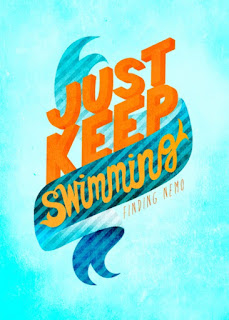
This week we learned all about the different types of typography and it was a very lesson. I learned so much about spacing between words, using different punctuation marks and using special characters, but my two favorite were about suing capital letters and having text in a box or frame. I found this example on Pinterest about the movie Finding Nemo unfortunately, there was no name of the creator attached.


The first typography essentials  that I learned about and is clearly in this picture is the two bright orange words in capital letters. This captures your attention because the letter are big, orange and take up most of the room compared to the other text.


Another typography is having words in a frame or box. this picture has a word in cursive inside a frame giving the whole picture more space. In this picture it really work since it is Finding Nemo the out side space makes it look like the ocean.


These two elements makes this picture stand out and attracts the eye giving it great contrast. It also works together since the text is in the middle and the middle section is in a frame it pulls the picture together and gives it a good example of what the text is about.


I really enjoyed reviewing this picture I think the author did such a great job from the different text to color and just in general all the different techniques used.

Saturday, April 29, 2017

Design Critic

For this week I decided to us this image below to critic and the designer put together this cover. I love the choice of colors on the picture I think the colors match very well and stay with in the pink and purple side of the color wheel.


(This image is from the cover of me&myBIGideas 365 planner. 

This designer decided to use very close proximity and in my opinion it was a good idea for this cover It centers the attention to the middle of the cover and there is no other words on the cover therefore, when a person looks at the picture there eyes automatically goes to the center. The text focus on the words best and ever which design wise looks pretty, but I do think year could have been a little bigger.


The alignment in this picture does a very good job keeping the visual connection because the letters are in the middle and then it has flowers on only two corners. Visually there is a right slanted line with design which makes it very pleasing to look at. It also keep the words unified because the words are in the middle only.


I think this cover offers a great example of repetition because it has the same flower on two corners. It has repetition, but it is not very over whelming. It gives it visual interest because the flowers are a lighter color than the rest of the picture making  the flowers stand out more.


In this design the designer used a little bit of contrast as the flowers are almost the same design but they are flipped so it doesn't match exactly. This gives it a little more interest and helps bring attention to the cover therefore more people are likely to pick up the cover.


In conclusion I feel like the designer did a great job with this cover. It definitely watched my eye as I was looking at planner covers to buy and after reading and learning more about design I understand why the design looks a certain way.

Make-up Loving!

This week we learned how to create different shapes and make icons which I decided my theme would be make-up and beauty related.  As a you...