Saturday, May 6, 2017
The Beauty of Typography
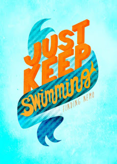
This week we learned all about the different types of typography and it was a very lesson. I learned so much about spacing between words, using different punctuation marks and using special characters, but my two favorite were about suing capital letters and having text in a box or frame. I found this example on Pinterest about the movie Finding Nemo unfortunately, there was no name of the creator attached.
The first typography essentials that I learned about and is clearly in this picture is the two bright orange words in capital letters. This captures your attention because the letter are big, orange and take up most of the room compared to the other text.
Another typography is having words in a frame or box. this picture has a word in cursive inside a frame giving the whole picture more space. In this picture it really work since it is Finding Nemo the out side space makes it look like the ocean.
These two elements makes this picture stand out and attracts the eye giving it great contrast. It also works together since the text is in the middle and the middle section is in a frame it pulls the picture together and gives it a good example of what the text is about.
I really enjoyed reviewing this picture I think the author did such a great job from the different text to color and just in general all the different techniques used.
Subscribe to:
Post Comments (Atom)
Make-up Loving!
This week we learned how to create different shapes and make icons which I decided my theme would be make-up and beauty related. As a you...

-
This week we learned more about the 10 composition rules which are: 1. Rule of Thirds 2. Balancing Elements 3. Leading Lines 4. Sym...
-
This week we learned how to create different shapes and make icons which I decided my theme would be make-up and beauty related. As a you...
-
For this week I decided to us this image below to critic and the designer put together this cover. I love the choice of colors on the pictur...


No comments:
Post a Comment